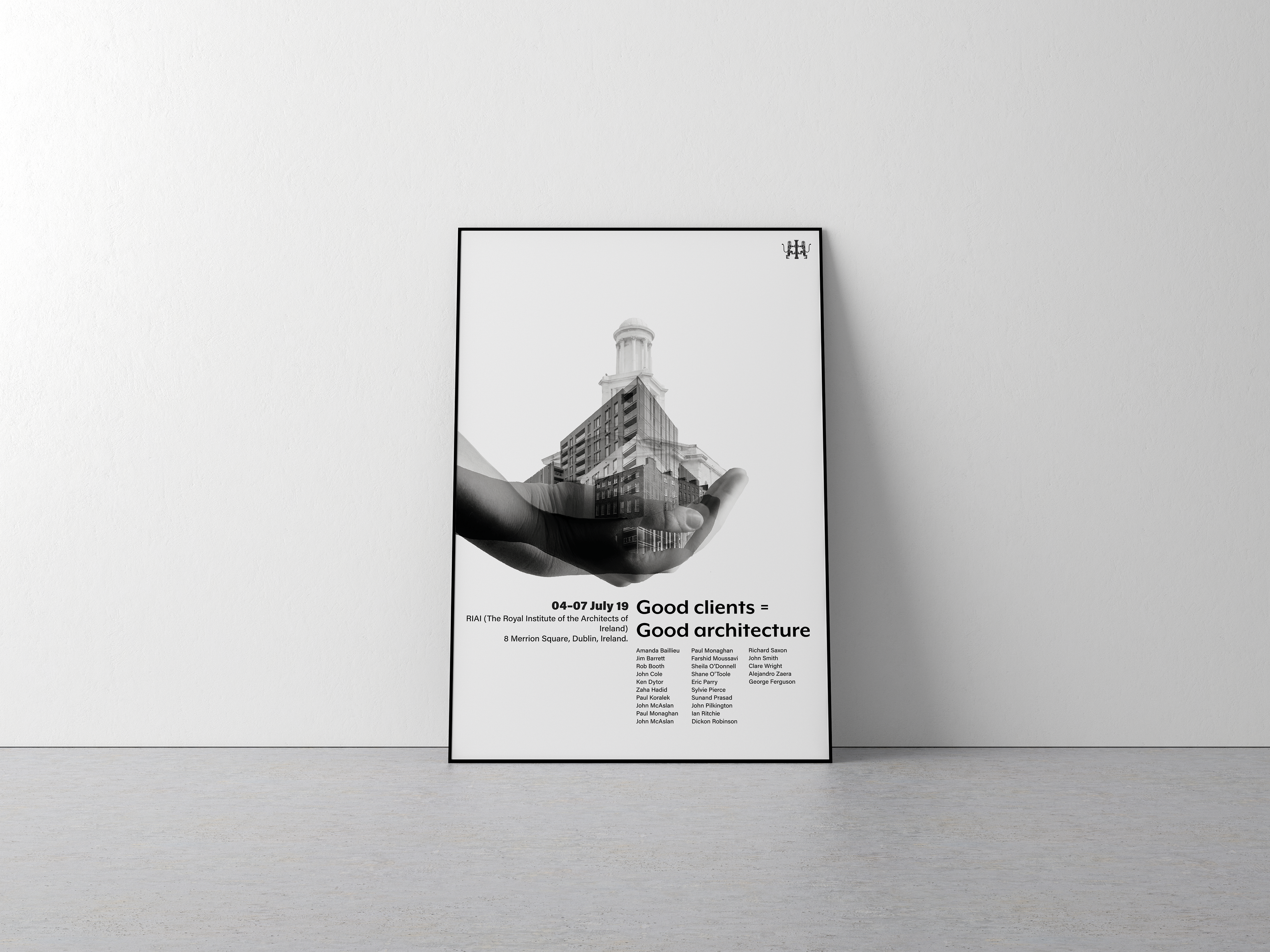
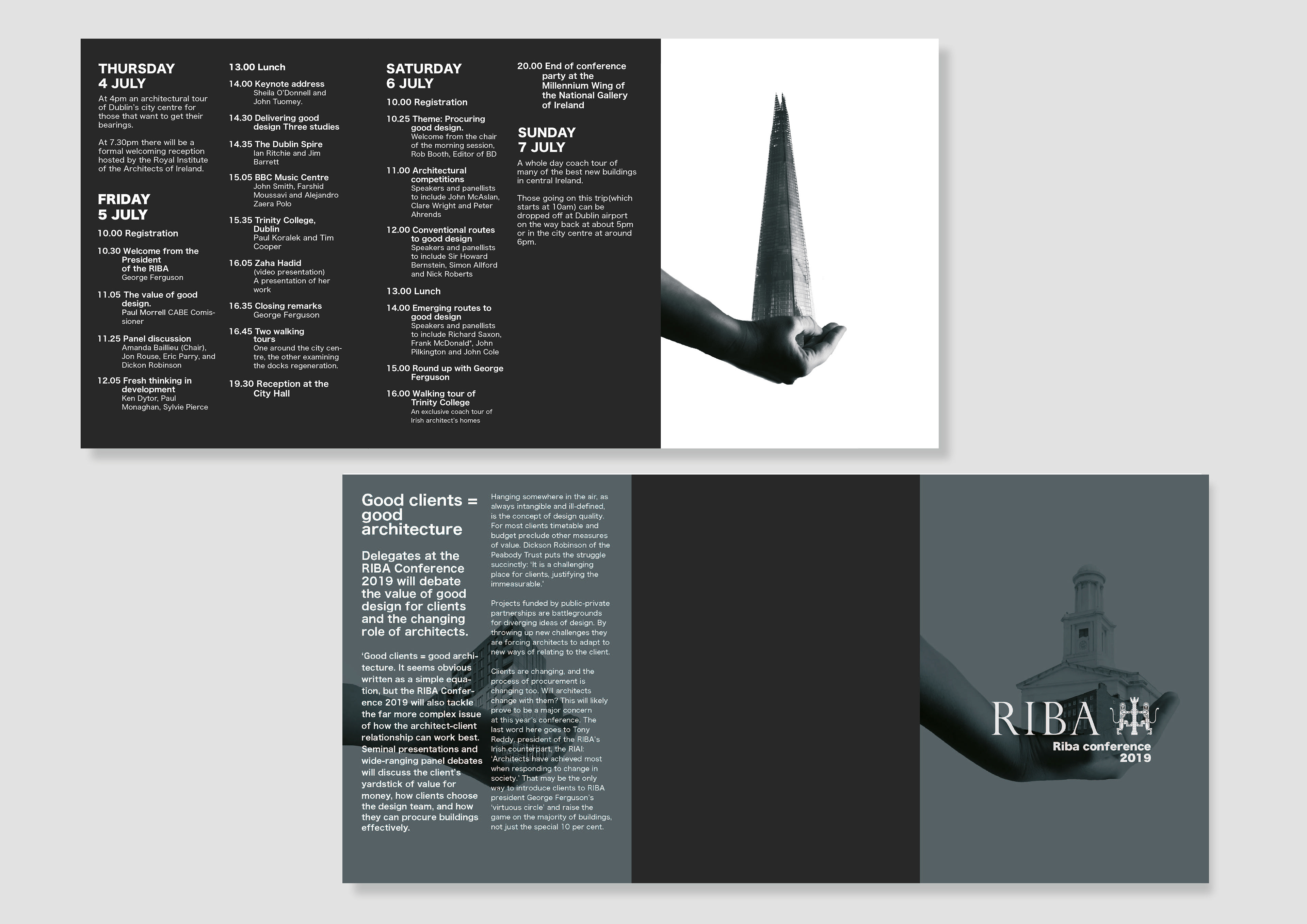
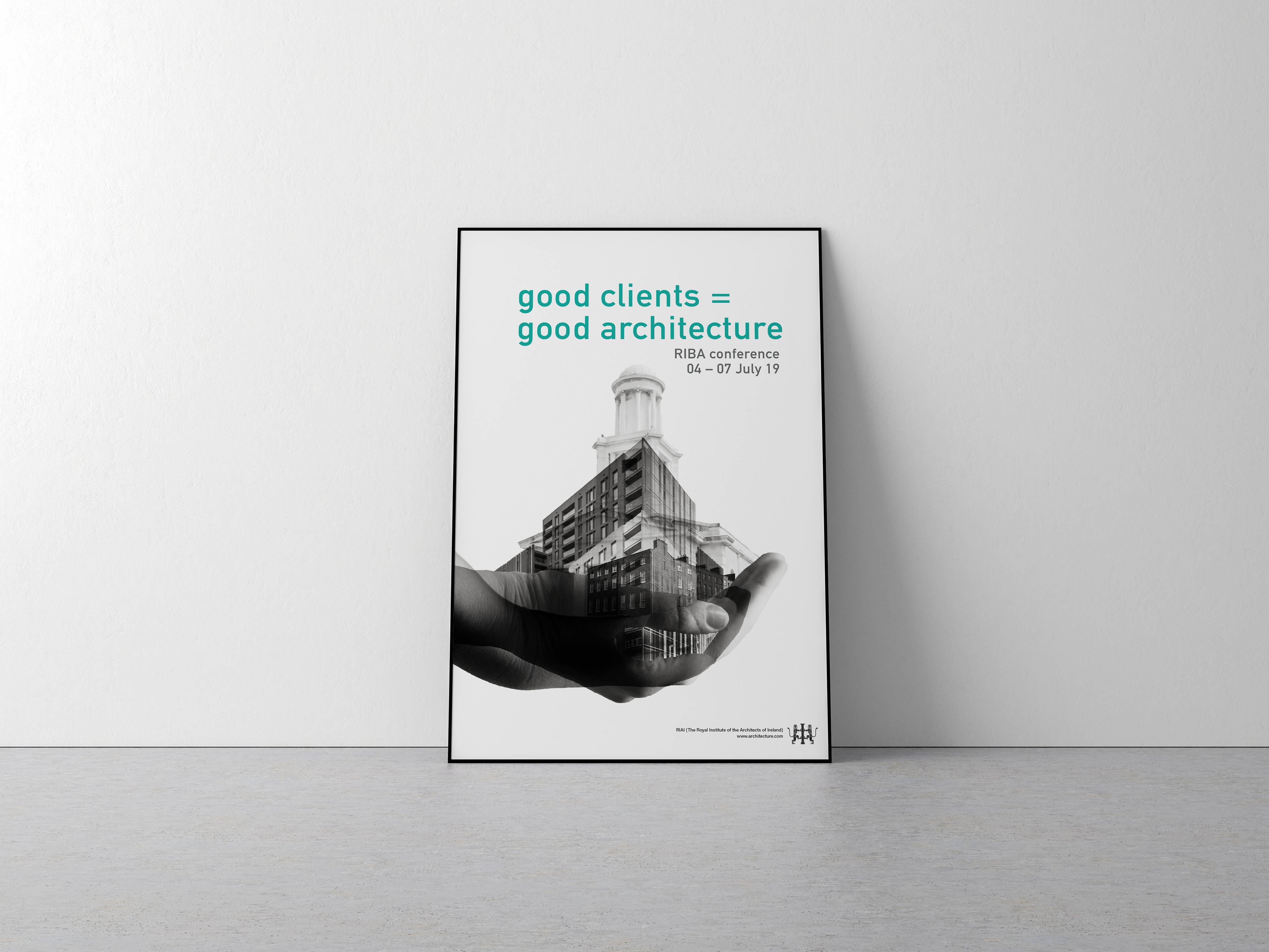
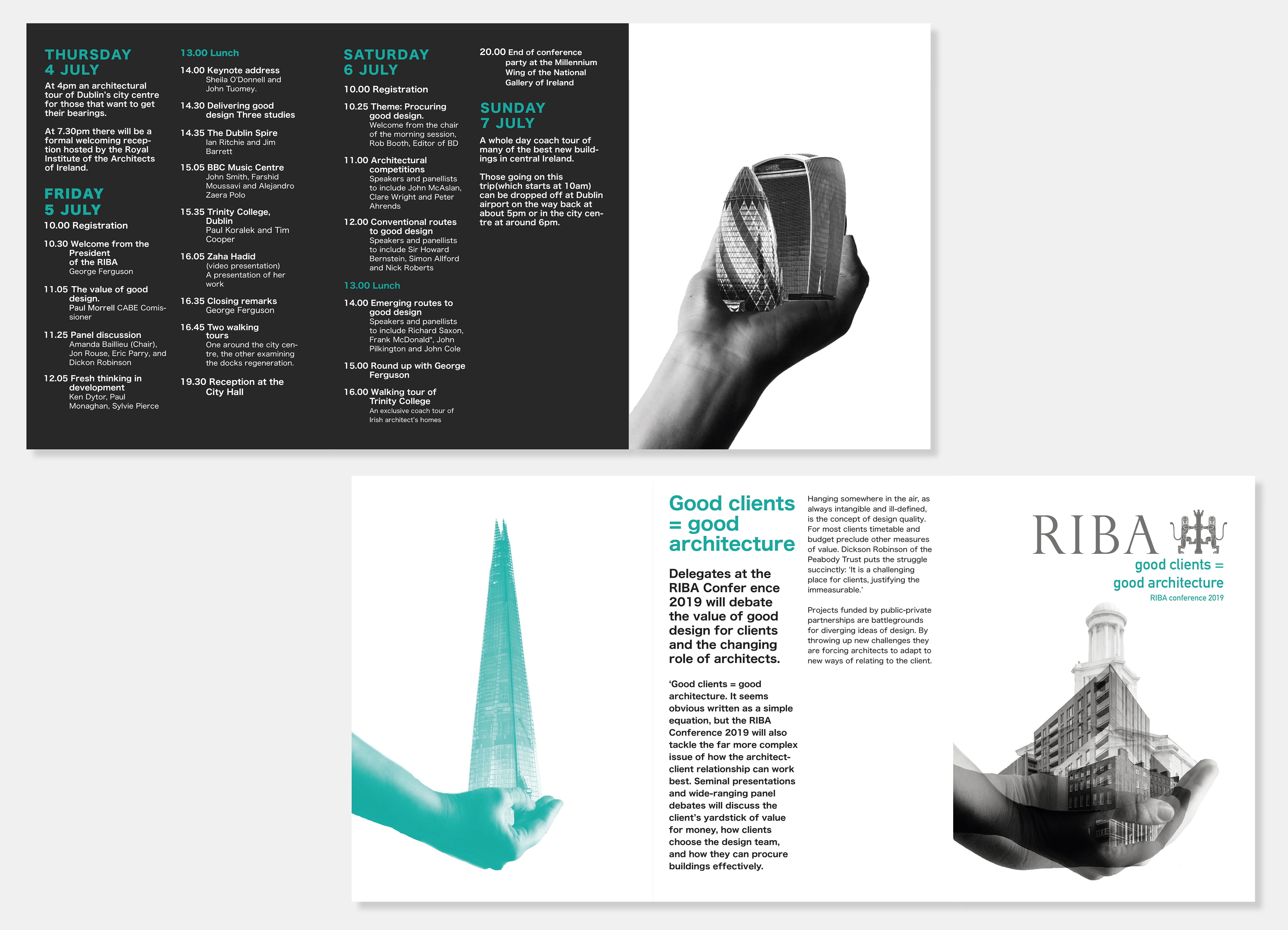
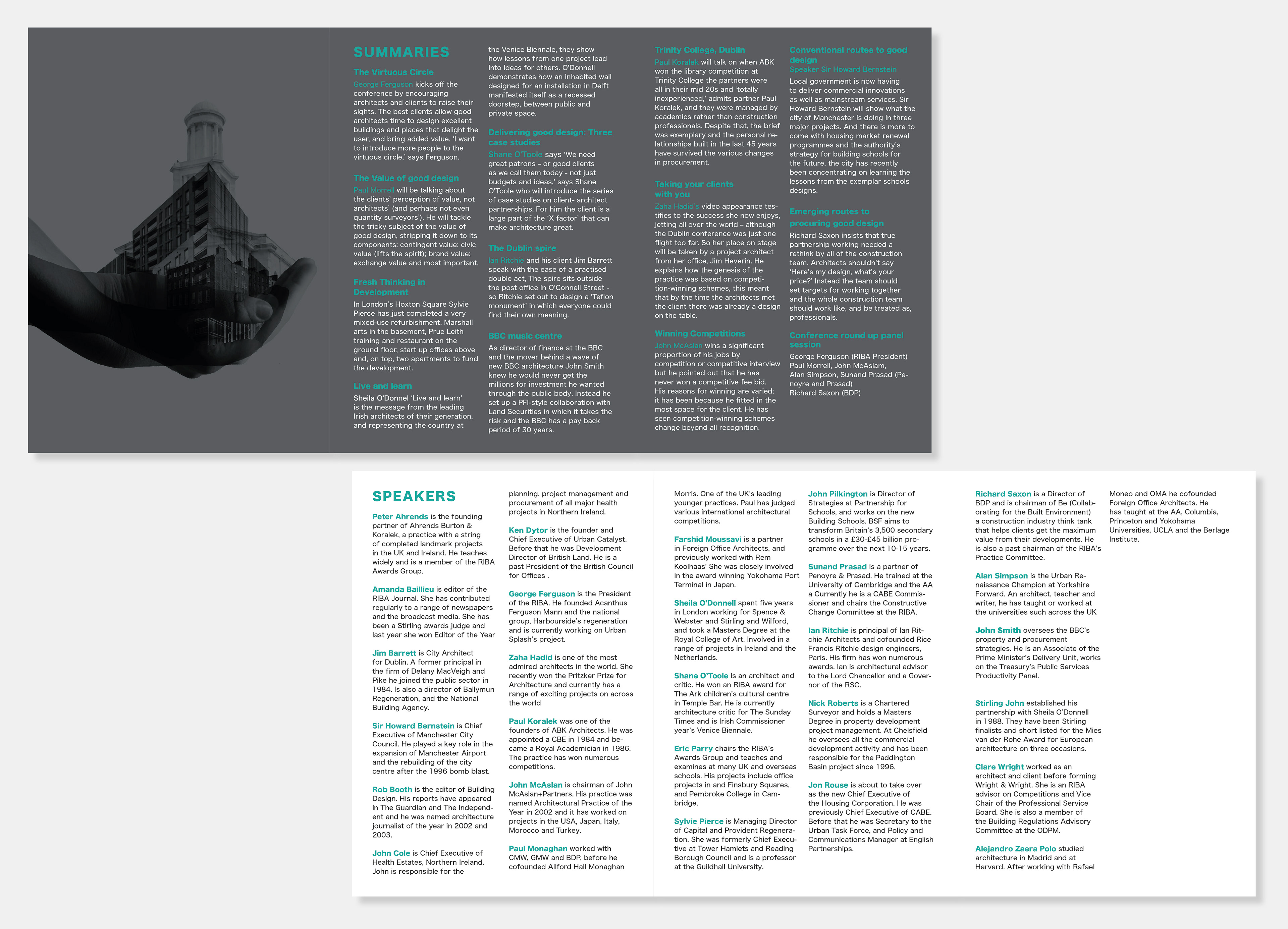
Riba poster
The brief was to create a poster, brochure and animation for the Riba architecture conference for client of the year. The theme was ''Good clients = Good architecture'' and we had to respond visually to this, providing a consistent visual approach to connect all items.
The brief was to create a poster, brochure and animation for the Riba architecture conference for client of the year. The theme was ''Good clients = Good architecture'' and we had to respond visually to this, providing a consistent visual approach to connect all items.
The concept
Firstly we had to Identify our concept: how we wanted to respond to the theme using appropriate graphic styles. The client is powerful, they choose how much money, time goes into it. They even participate in the overall design and layout of the building, with the guidance of the architect.
What I learn't from this project was the concept is really important when designing. Visual images have a lot of meaning, and subtle meaning behind images can have a profound effect on the overall outcome. We spent a lot of time developing the concept and understanding what the brief was asking.
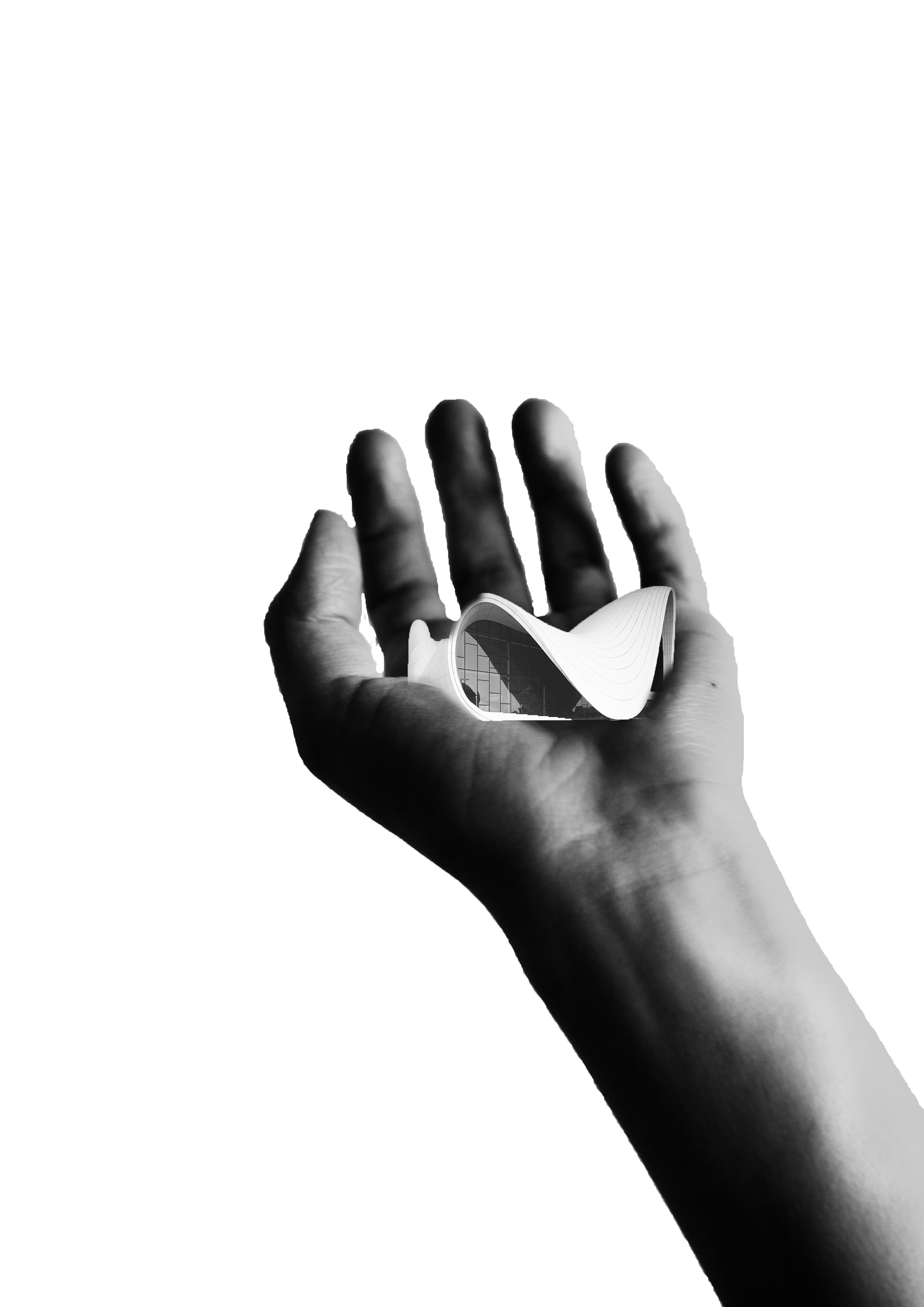
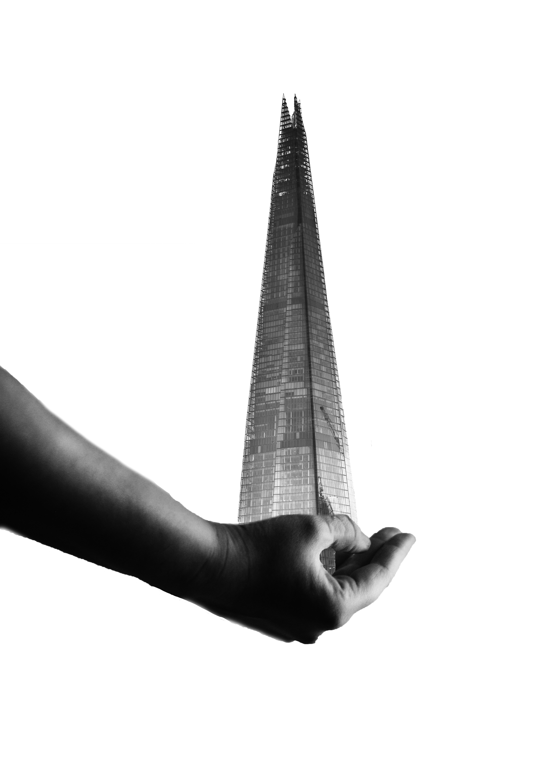
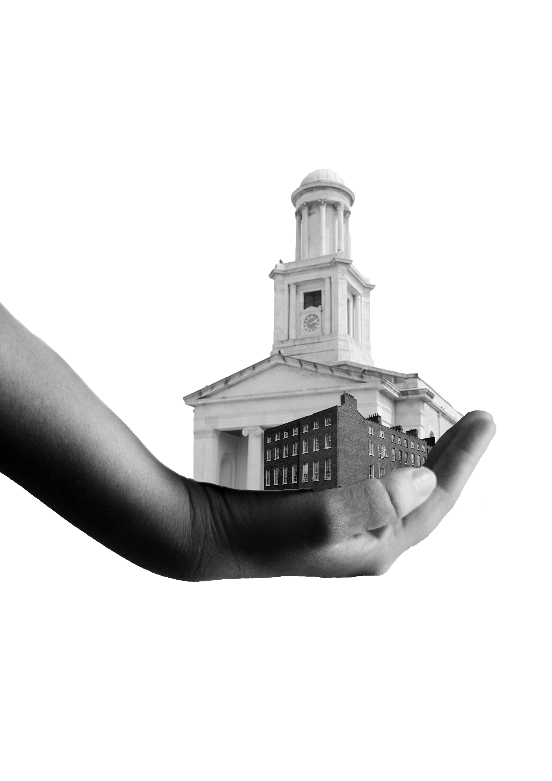
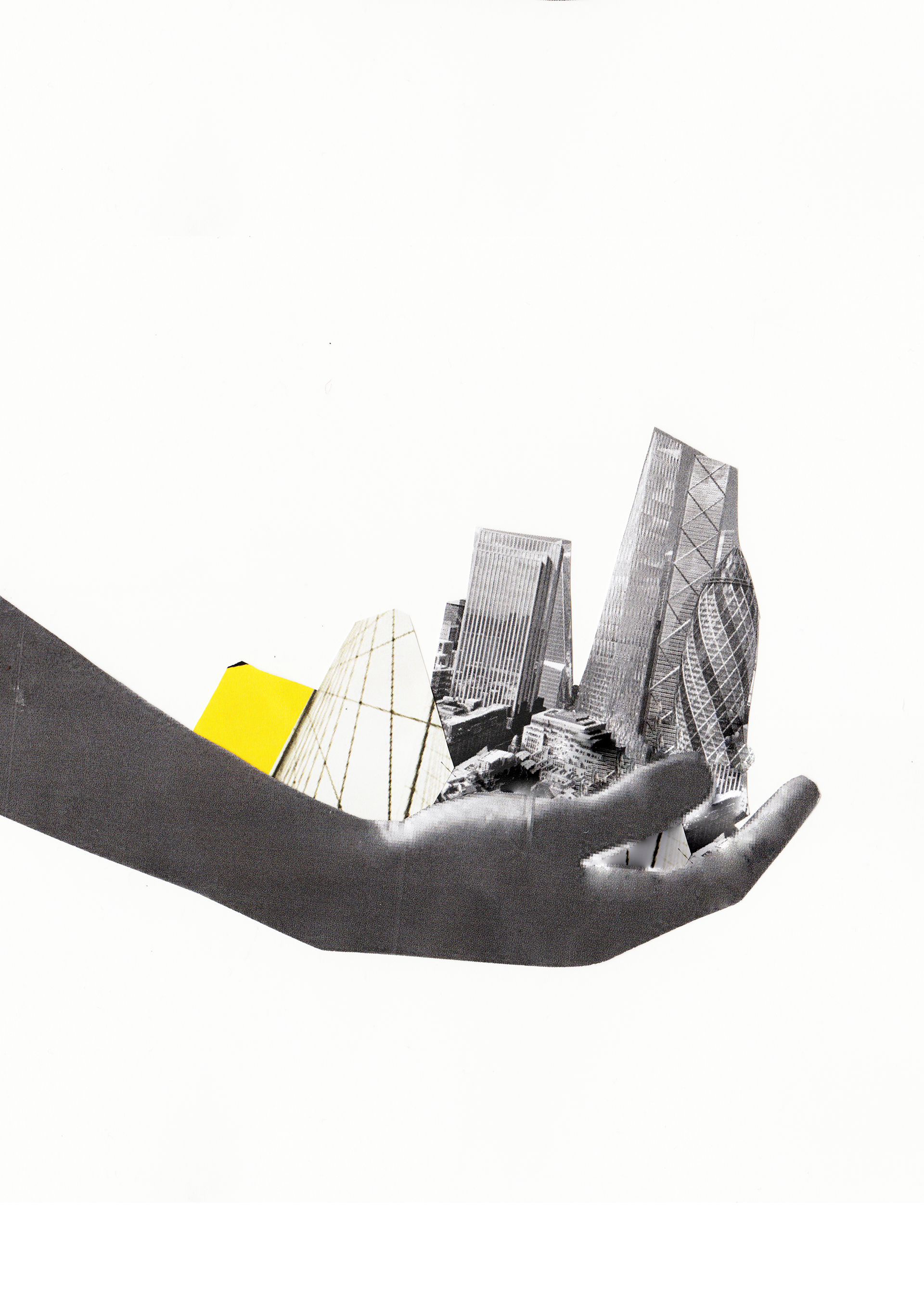
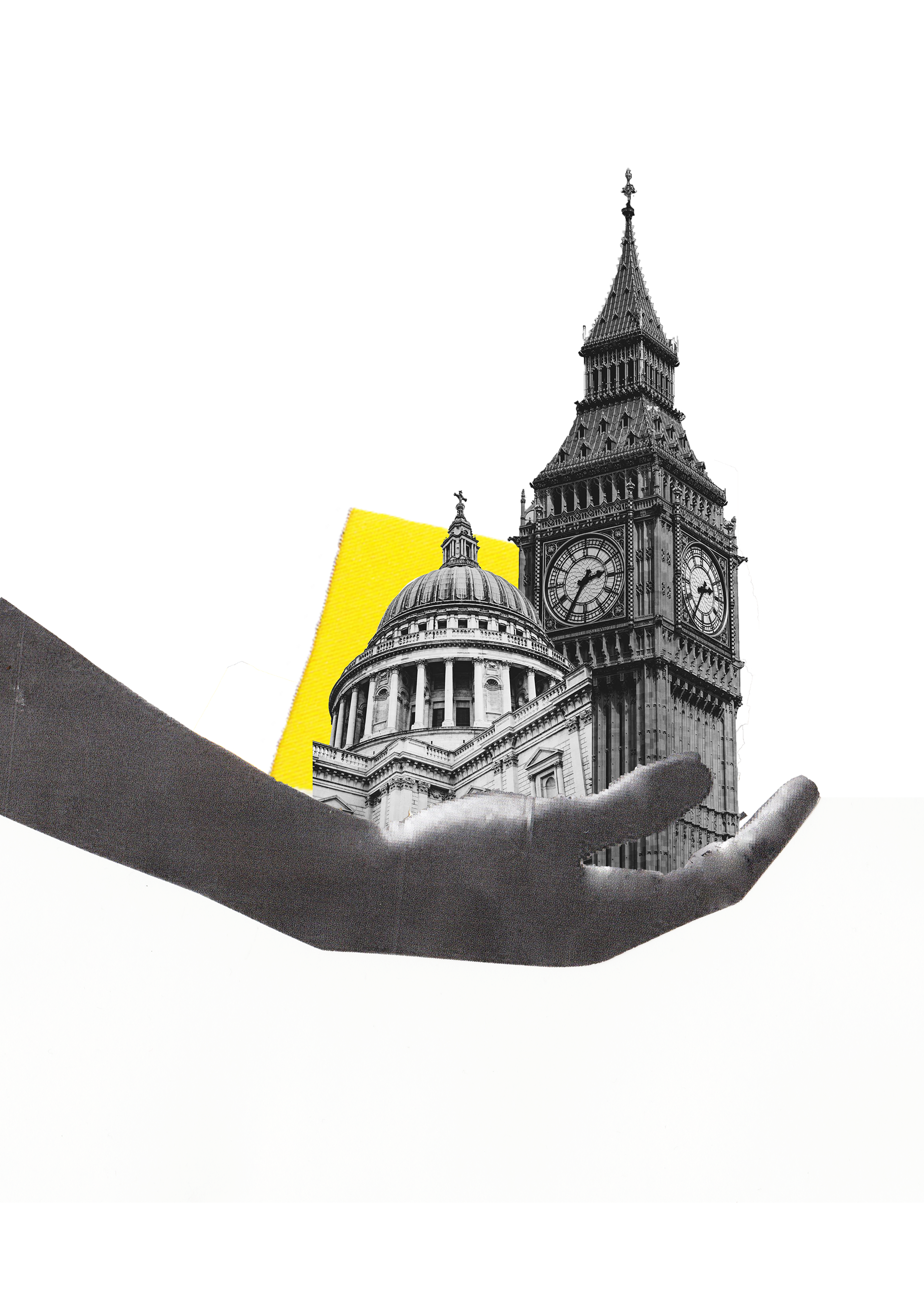
My concept behind the image: The development of the project is in the hands of whether the client is good or bad.
The journey
By articulating the chosen concept for the poster, the evolving of the visual idea continued. I put together some mood boards and started to look at the theme of a client being in control of the weight of architecture. The idea was that the hand needed to look like it was actually holding the buildings, and the quality of all images.
In response to feedback, the purpose of the yellow cut out shape didn't hold any significance or communicate something architectural or client, which was the main focus of this visual approach.
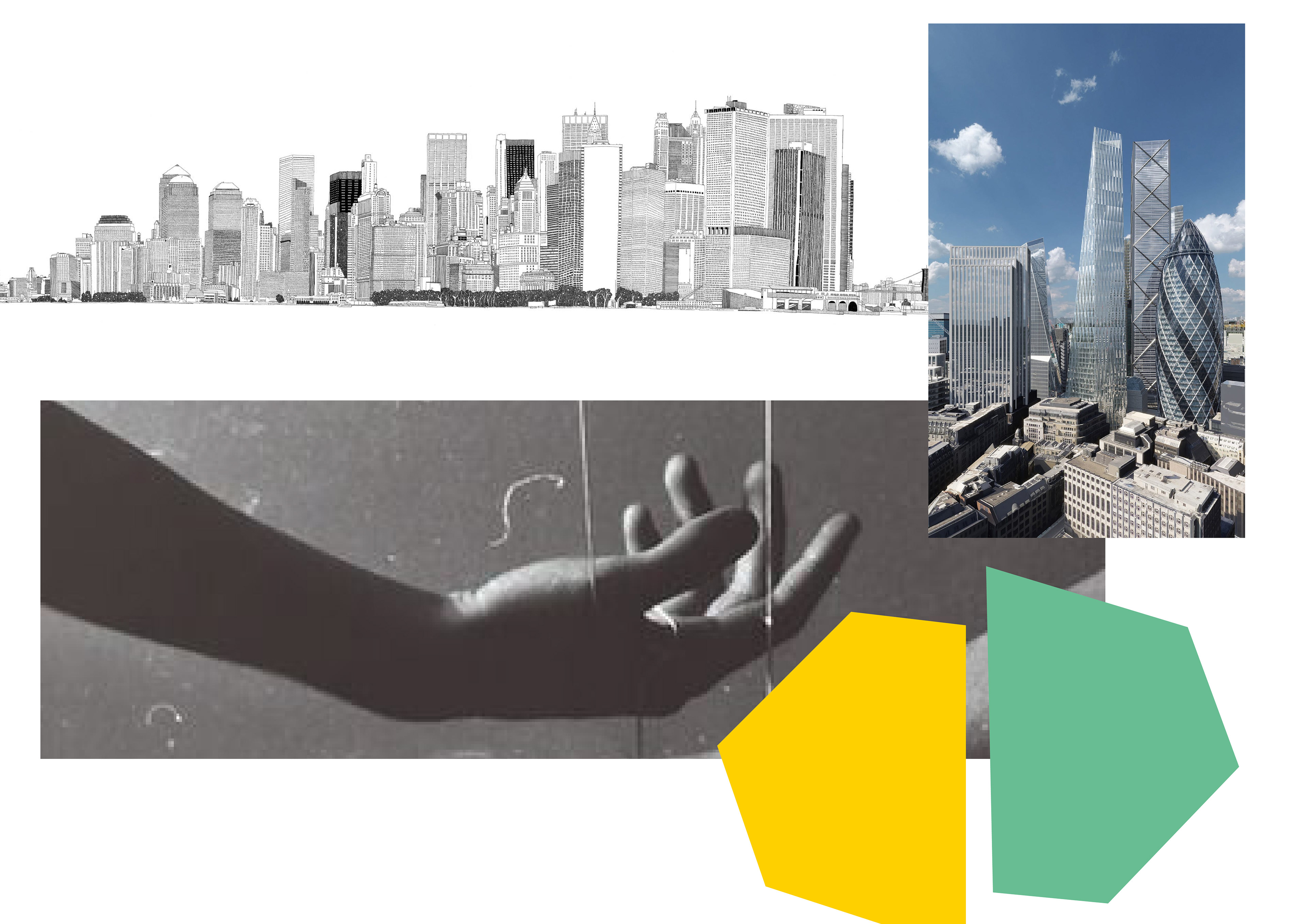
The project before being reworked...